
EM Diagrams Aren't Just for Fighter Pilots Anymore
By Nicholas Len · Founder · CFI/CFII/MEI · former F/A-18 + RAF Typhoon pilot/instructor · A&P · 2026-05-14 · 9 min
Originally commissioned for AOPA (commissioned 2025; previously unpublished)
If you've ever stared at a performance chart that looked more like a spiderweb than a simple graph, you weren't alone — I was confused, too. Following lines and contours to extract useful insight isn't exactly intuitive. But not long ago, a visionary approach changed that: the idea of combining all key flight performance data into one cohesive view — the Energy Maneuverability (EM) diagram.
Originally developed for high-performance military jets, EM diagrams evaluate turn capability, energy retention, and control limits across the full flight envelope. For decades, they've shaped how fighter pilots train, fly, and survive.
Today, it's time these diagrams find their place in general aviation. Whether you fly a DA20, a Baron, or an Extra 300, an EM diagram offers something most POHs never will: a complete, visual understanding of how your aircraft actually performs.
From Fighter Roots to Flight Schools
Energy management gained traction during the Cold War as a way to give fighter pilots an edge in Basic Fighter Maneuvers (BFM). Engineers like John Boyd and Harry Hillaker used EM diagrams to evaluate aircraft like the F-16 — tools that visualized how speed, G-loading, and altitude interact in real time to maximize aircraft effectiveness.
I saw this firsthand during my time as a pilot and instructor on the F/A-18A, C, and E, and later as a Typhoon instructor with the Royal Air Force. EM diagrams weren't just training aids — they were foundational tools. Whether teaching BFM, evaluating weapons envelopes, or planning tactical engagements, we used these diagrams daily. They weren't just charts — they were lifelines.
Since transitioning to GA flying and instruction in 2021, I've often asked: why don't we have this in general aviation? The physics don't change just because the aircraft does. Every airplane — from a DA20 to a DHC-2 Beaver — operates inside its own energy and maneuverability envelope. Bringing the clarity of EM diagrams to GA in a way that's intuitive, practical, and safety-driven has been a long-standing goal.
Now it's here.
What an EM Diagram Reveals
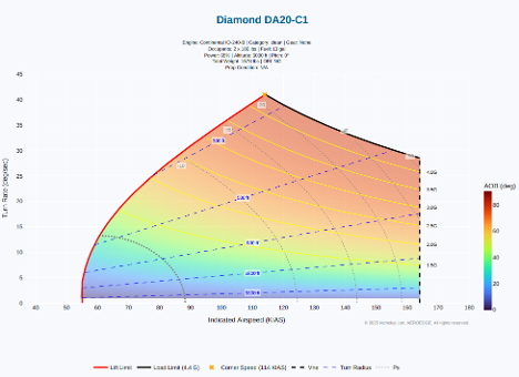
An EM diagram plots indicated airspeed (IAS) on the X-axis and turn rate (degrees per second) on the Y-axis. What fills the space between is the true performance envelope of the aircraft.
Take the DA20-C1, clean configuration, as shown in the diagram above. Several elements stand out:
- › Lift Limit Line — the stall boundary, where low-speed, high-G, or steep-bank flight results in loss of lift
- › Load Limit Line — the structural G-limit of the airframe
- › Vne Line — the aircraft's never-exceed speed
- › Ps Contours — show where the aircraft can gain, lose, or maintain energy (specific excess power)
- › Turn Radius Lines — representing the horizontal distance required for a sustained turn
- › Bank Angle Shading — visual cues for maneuvering effort at each point in the envelope
- › Cornering Speed — the point of peak turn rate, where lift and G limits intersect
What's buried in the POH becomes immediately visible: optimal maneuvering speeds, the effect of weight or CG on turn performance, and how performance shifts with power setting, altitude, and configuration.
More Than Just Numbers — It's About Safety
POHs are designed for certification — not necessarily comprehension. They present performance data in fragments, often simplified, sometimes overly conservative. But flying is dynamic, and real-world conditions rarely match standardized test scenarios.
An EM diagram connects the dots:
- › See how flap deployment affects stall margin and turn radius
- › Visualize how a forward CG degrades turning capability
- › Understand how steep turns can rapidly bleed energy — and how much stall speed rises
- › Pinpoint where Ps = 0, showing the speed and G-load at which level flight can be sustained without climbing or descending
This isn't just academic. It's about preventing loss-of-control accidents by giving pilots a clear, visual sense of when they're approaching the edge — especially during pattern work, low-altitude maneuvering, or poorly coordinated flight.
And the diagram earns its keep most when it lives on the ground, not in the cockpit. A pilot who has run the EM model for today's weight, CG, and density altitude knows where the dangerous corners of the envelope actually live, before the airplane ever rolls. That discipline — knowing the numbers before you need them — is what the tool exists to support.
And for experimental aircraft builders and test pilots, EM diagrams offer something even more valuable: a tool for envelope definition. During Phase I testing, understanding stall boundaries, turn performance, and energy margins can accelerate the process while dramatically improving safety. Rather than discovering handling quirks through trial and error, pilots can map performance with precision.
Essential for CFIs, Aerobatic Pilots, and Transition Training
For instructors, EM diagrams are a goldmine. They visualize pitch stability, G-loading, stall behavior, and control authority in a way no textbook ever could. They're especially powerful for stall and spin awareness — showing how stall boundaries shift with weight, G-load, and CG, and why a seemingly routine maneuver might suddenly go wrong.
For aerobatic pilots, the advantage is even clearer. Instead of flying to the edge and feeling it out the hard way, pilots can plan high-G maneuvers with confidence — knowing exactly where the airframe remains within its structural and aerodynamic limits.
And for transition training, EM diagrams offer a direct comparison between aircraft. How does a DA20 behave compared to a Piper Archer? How does a Baron's turn performance change with one engine out? These are questions no POH answers — but they become instantly clear in a well-modeled EM diagram.
Base to Final: Where Margin for Error Vanishes
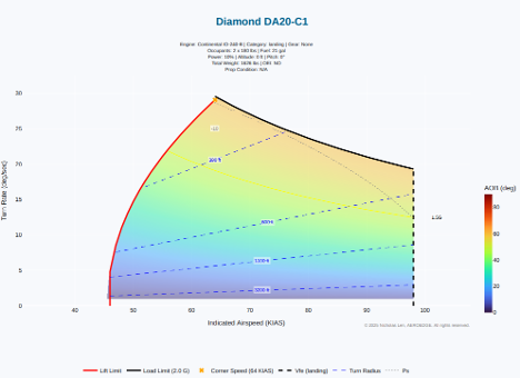
Let's take a DA20-C1 in the pattern: flaps full, power near flight idle, 60–65 KIAS approach speed — a common setup on base or final.
On the EM diagram, that configuration puts the aircraft right on the edge of the stall boundary and well below the point where it can generate any positive specific excess power. In fact, Ps is so negative that the aircraft is losing energy at a rate equivalent to nearly 10 knots per second. At this energy state, even a 10° increase in bank or a skidding correction to final can raise stall speed and load factor just enough that, combined with rapid energy loss, the aircraft crosses into the stall region in under a second — often with no warning. In this configuration, a stall can quickly become an unrecoverable spin entry, especially if the aircraft is uncoordinated and low to the ground.
This is what makes EM diagrams so valuable for instruction. Instead of saying "don't overshoot final," we can now show exactly why that's such a high-risk moment. With low energy, no climb performance, and rapidly increasing stall speed as bank angle rises, the safe envelope disappears fast.
Most students — and many instructors — rely on rote memory and pattern cues in this phase of flight. But as the diagram shows, when things go even slightly off-script, energy margin becomes razor-thin. A skid to correct an overshoot, combined with low airspeed and full flaps, can rapidly shift the aircraft into the stall region — and it's already too late.
This is what EM diagrams bring into focus. It turns pattern work into a visible maneuver envelope, showing how quickly a routine setup becomes a departure scenario.
Beyond the Pattern: What Else the Toolkit Reveals
The EM diagram is the foundation, but it's only the beginning of what the same physics engine can show. The TallyAero training toolkit extends EM-style visualization across the full menu of GA maneuvers and emergency procedures — and every one of these is flying today, not on a roadmap:
- › Dynamic Vmc curves — how minimum control speed actually shifts with bank, configuration, weight, and density altitude, instead of a single red tick on the airspeed indicator. (Covered in depth in the companion piece, "When the Red Line Isn't Enough.")
- › Power-off 180 geometry — wind-corrected glide-path and turn-radius solutions overlaid on satellite imagery, using real aircraft weight, prop condition, and best-glide performance
- › Engine-out from any altitude — position-aware glide strategy that picks the right approach (direct final, base-to-final, overhead spiral, pattern intercept) and shows exactly where the airplane will touch down
- › The impossible turn, made conditional — reaction-time delay, speed transition, and turn arc plotted as a tangible decision tool rather than folklore
- › Ground reference maneuvers — rectangular courses, S-turns, and turns around a point shown as the wind-shaped patterns they really are, with the bank angle on each leg calculated from groundspeed
- › The maneuver library — steep turns, lazy 8s, chandelles, steep spirals, and the precision power-off 180 all rendered as visible paths through space
- › OEI performance visualization — climb and turn capability with one engine feathered or windmilling, across the full envelope
Each of these is its own conversation, and I'll be covering them one at a time in the articles that follow this one. The thread tying them all together is the same one that runs through this piece: the airplane's behavior is geometric, not magical, and once you can see the geometry, you can fly it better.
EM Is for Everyone
The Energy Maneuverability diagram is no longer the exclusive domain of fighter pilots and engineers. It's becoming an essential tool for anyone serious about understanding how their aircraft performs — and how to fly it smarter and safer.
So next time you brief a flight, think beyond Vy and Va. Consider turn radius. Consider stall margin. Consider how energy state affects control. Because in the real world, performance isn't a static number.
It's a moving picture.
And now, we have the tools to see it.